

|
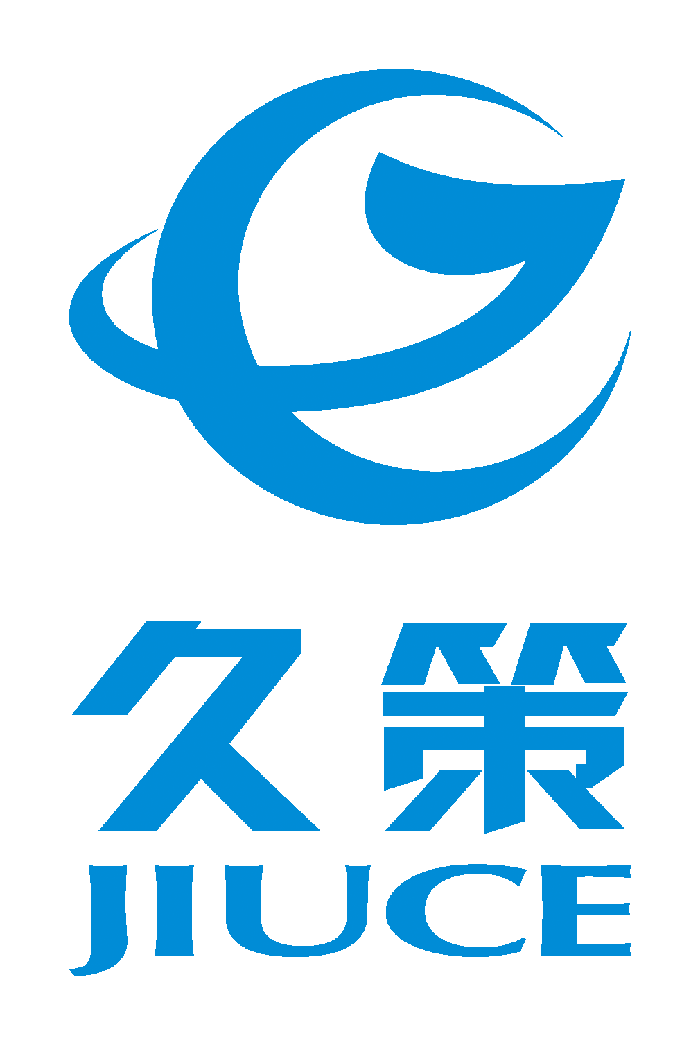
The pattern is mainly colored in technological blue, full of technological fashion sense, and has a simple and atmospheric visual impact. Blue represents the sky, showcasing the broad mindedness of Jiuce, committed to quality building and pursuing sustainable business development attitude. The word "Jiuce" comes from the "Chronicles of Geng Yan in the Later Han Dynasty": "Guotu Jiuce". 'Long term strategy' means a long-term strategy; It also implies long-term cooperation, and the established enterprise can develop for a long time. The Jiuce logo pattern is a combination of the letters J and C, containing the first letter of Jiuce's company name. The J in the pattern is an active upward arrow shape, representing the company's optimistic outlook for the future and continuous exploration and progress; The C in the pattern is set against the Earth circle, symbolizing the global gas industry's takeoff and full of confidence in the future. The letters J and C embrace each other, representing the belief of honesty, trust, and sincere service of Jiuce people. The overall pattern symbolizes the flourishing development of Jiuce's business, and Jiuce's partners on the ecological chain will be spread all over the world, connecting every corner of the world. |

Copyright ? 福建久策氣體股份有限公司(jiucegas.com) All rights reserved